I am going to make a leaflet for my deforestation campaign, so I have to look at the other examples of leaflets to help me get ideas. I would like to see the layout of a leaflet to help me decide what it will look like.

I do like this layout, it looks clear to read and the title of the fonts are eye catchy to catch the reader and make them read the information. I also like the images there spread across the bottom of the page it makes it interesting and the images relate to the information on there.
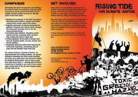
I also like this layout it has a different range of colours to it, its got a bright orangey tone to it. The bright colours is eye catchy and you could notice it from far away. It also has images in, going across the bottom and this makes it not boring for the reader.
I do like this layout, it looks clear to read and the title of the fonts are eye catchy to catch the reader and make them read the information. I also like the images there spread across the bottom of the page it makes it interesting and the images relate to the information on there.
I also like this layout it has a different range of colours to it, its got a bright orangey tone to it. The bright colours is eye catchy and you could notice it from far away. It also has images in, going across the bottom and this makes it not boring for the reader.
Comments
Post a Comment